Same product, more breathing room and depth
This is a quick concept pass on Lork's homepage and AI Website Builder page, built from the live site (screenshots below, taken today). It shows the direction from the brief: stronger grid and spacing, a clearer type scale, and subtle depth instead of flat panels — without touching the brand's gradient/dark identity or the existing copy.
Full scope ships as a Figma file (desktop + mobile), ready to hand to your engineers.
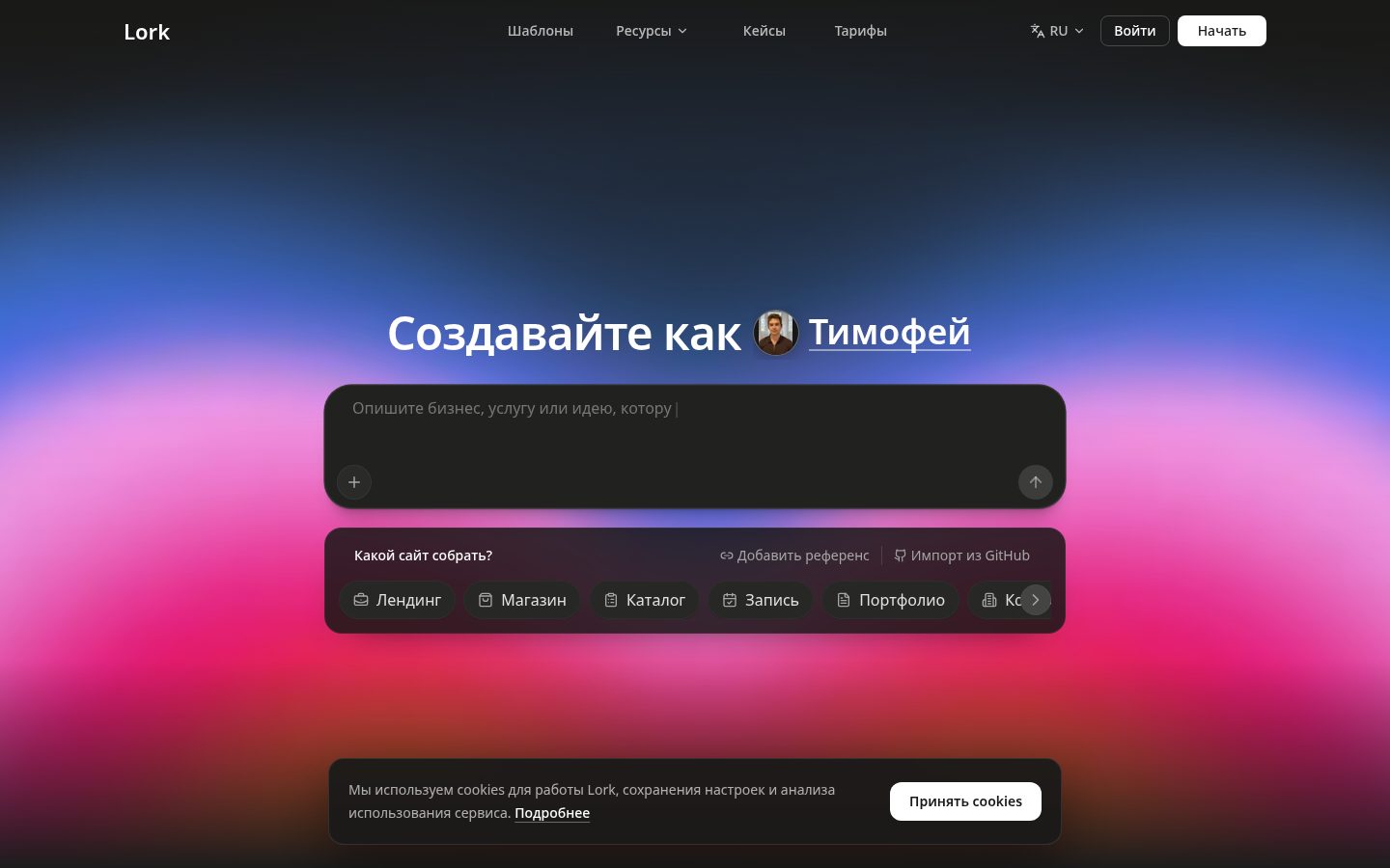
Build like Timofey does
Describe the business, the service, or the idea you want to bring online — Lork drafts the structure, the copy and the first working version.
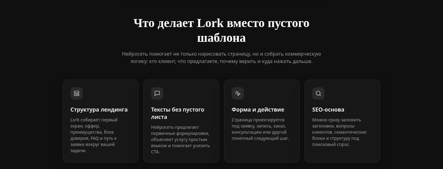
What Lork does for you
Landing structure
Hero, benefits block, FAQ and the fields your niche actually needs — decided for you, not left blank.
Copy, not lorem ipsum
The AI drafts real headlines and offer copy, so the layout is judged on the real thing.
Working form
Contact and lead capture wired to a real endpoint on the first draft, not a static mock.
SEO baseline
Semantic headings and meta out of the box — the structure search engines expect.
Section padding and card gaps follow one 8px scale end-to-end — right now they vary block to block, which is what reads as "cramped."
One consistent hierarchy for H1 → H2 → body across both pages, wider line-height on body copy for legibility on dark backgrounds.
Soft shadows and a light glass treatment on key surfaces (input, cards) instead of flat near-black panels — keeps the same palette, adds contrast without new colors.